Logo design: The art, science and struggles.
This was supposed to be a blog about the new Akhia logo, its meaning and its inspiration. That would be easy to write. But, as many of you know, logo redesigns are not easy. In fact, they can be a real struggle.
Why?
We ask a lot of logos, type treatments and marks. They must be both simple and meaningful. Recognizable and repeatable. And they must accurately represent an organization, its values, its products, its people and its customers.
If that’s not enough, they must strike just the right emotion and make people feel something.
Not easy.
So, to go behind the new Akhia logo, we need to first acknowledge that it didn’t just appear. It took hard work, collaboration inside and outside of Akhia and many visits back to the drawing board. “I’ll know it when I see it,” and “we’re just not there yet,” were uttered many times.
Things worthwhile take time, and we took it. Here’s a look behind the scenes building up to our “this is it!” moment.
What we asked of our logo.
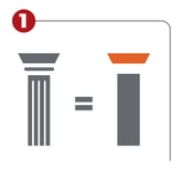
 It needed to celebrate our history. In the beginning, every iteration of our logo included a pillar of some sort. Our name, Akhia, has origins in Ancient Greece where there are abundant columns in architecture. Since communications are a pillar in every great organization, it holds a great deal of meaning to us. Could we work it into the new logo?

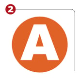
It needed to embody our confidence. If you’ve worked with us for a while, you’ll remember that we went from AKHIA to akhia. And we missed those capital letters. They were strong, they stood out and they represented our confidence as an agency and as individuals. We asked, is it time to bring it back?

It needed to convey our niche in manufacturing. Those are words we used a lot internally. For decades, we have represented both makers of B2B products and consumer goods. We could say with confidence that no one gets manufacturing like we do. Let’s own it (read more from Ben here). Could the logo convey a feeling of expertise in manufacturing?
Could we have it all? Time would tell.
Exploration and reexploration.
When we first started the process, we thought we might just make some subtle tweaks to our existing logo. Maybe we could get to that feeling without going too far. As we got bolder, we started exploring custom fonts, simple type treatments and marks.
And for every mark we explored, we couldn’t help but say “that could be for anyone,” and we weren’t settling for anything other than what is uniquely us.
We would see something, sleep on it, and realize we were not there yet. This went on for months, maybe longer.
Then one day it just clicked. “The one.” The reaction was immediate. The feeling, the sentiment and the aha! were all there. It was worth the wait.
The final product.

When you put it all together, you have a confident, modern logo that signifies our strength, as well as the strength of our manufacturing partners. It is simple, feels like us, nods to our history and builds excitement for the future.
Building stronger brands, From the insight out.
 I’ll close by saying that brand building is something we do all the time for our clients, and we do it very well. That’s because we are able to provide an outside perspective, and we can see what they may not be able to see for themselves.
That was the case with our own brand, too. We were too close to it. And by leaning on outside perspectives at times, we could finally see ourselves more clearly.
In the end, we can look back fondly on the struggles because they were necessary. The hard work is what got us here.
Written By Patsie Dionise Vice President, Channel Experience
Explore These Topics
